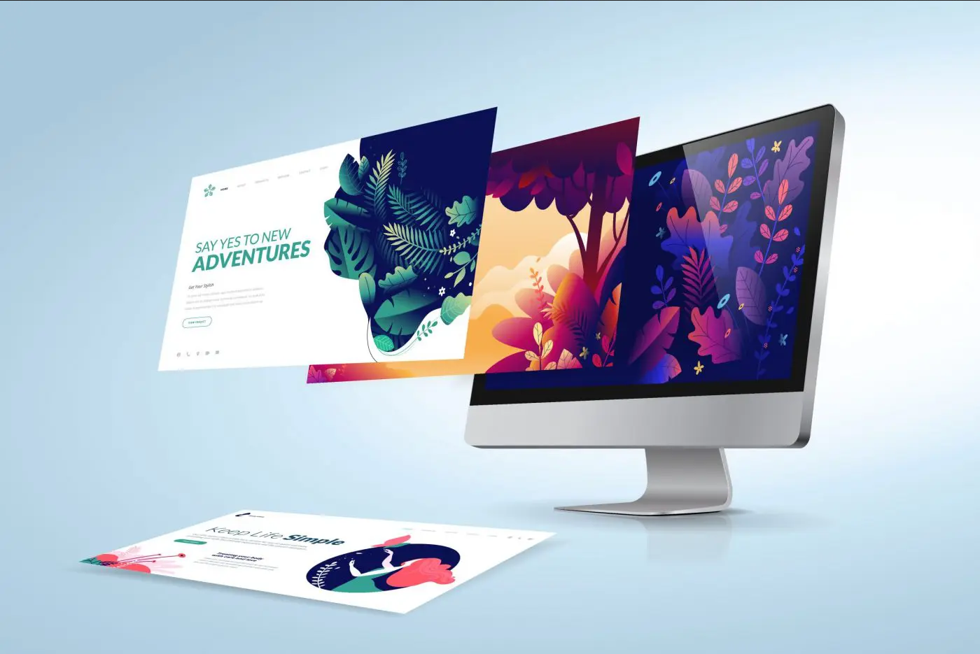
Your website is an opportunity to connect to the public, potential partners, prospective clients, and essentially the entire world.
This is a place where you want to tell your story and engage with individuals in a way that leads them to a desired result, whether that be a call, purchase, consultation, or a download.
Your website answers the “this is who we are, this is what we do, and this is what I want you to do” questions.
It’s your story.
Words are powerful, but when it comes to websites, design is a significant component. A busy, cluttered site can send out a mixed message or bury a message altogether.
A clear, purposeful site does a better job, but there is a limit. A site that goes too far with simplicity and white space can create an underwhelming message or lose visitors’ focus.
There’s obviously a lot to think about. Let’s take a look at some of the most critical web design components and what they have to say to a visitor.
1) Load performance – When a user visits a website, you have precious little time to engage with them – nobody likes to wait around. Load-oriented design means that components are designed to load quickly, paying respect to size, positioning, and technical composition.
2) White space – It is difficult to avoid the impulse to fill space. However, white space on a page enables the page, through design, to guide the visitor to what is most important on your page. It might be a capture dialog, it might be a product, it might be a phone number – whatever it is that you want to highlight can only benefit from a proper amount of room around it.
3) Line space and padding – Reading should be easy and without proper spacing, users can easily get lost in crowded spaces. With padding, attention is paid to the proximity between text and other elements of the page – page components should flow together, without conflict or distractions.
4) Mobile experience – Mobile design is a must-have. Every day, all day, visitors surf and engage on their phones – they demand websites to look good on mobile. Responsive page design allows for a variety of device sizes to present pages in an optimized design style.
5) Symmetry – Symmetry of page components is pleasing to the eye and keeps readers engaged with your message and brand.
6) Colors – Getting the fundamentals of color consistency, contrast, and color selection correct make all the difference you need to stand out and appeal to visitors.
7) Design components – Use and don’t overuse design components. Text boxes, graphical cues, radio buttons, and many components can help create your business story effectively. It’s easy to get carried away however, meaning it’s possible to clutter up pages with too many components.
Note that regardless of what platform your site is running on – custom code, WordPress, and beyond, you’re going to need to do some design planning. Anything short of that, or off the shelf, can result in an ineffective effort, loss of SEO, and most significantly, a lost opportunity to evoke the message you want to share with visitors.
It’s a competitive online world and you need a professional, attractive design that is developed through a proper, purpose-driven design process.
The finished result of a great design process should look unforced, is easy to navigate, performs well, and shares the message you want to share effectively.
At NetNation, we’ll design for your business a brand new modern, professional, beautiful, and responsive website with all the features you need to attract and convert visitors into customers.
Interested? Learn more about our Website Design Services.

